Monday, April 25, 2016
Communication Artifact - Bear Bones System
I was in charge of creating the commercial for our project. My vision for this commercial and all the possibilities for our product in St. George was vast. However, with the only prototype of the product being in the Salt Lake area and very little time to create the commercial we had the creator and owner of the company film the trailer at work and send me all the footage in which I was able to go through and cut this commercial. As I looked through the footage I could see that his cameraman that was piloting the drone was not a professional camera man and so I had to work with a lot of footage that had shadows of the drone or that were shaky shots and luckily I was able to salvage enough footage to put together this advertisement. I was focused on lining up musical cues with the royalty free music I got off of the Youtube creator tab that gives the user tons of free music to use in creating a video without having to give credit for the song. Once I lined up the video with the music I brought in a voice actress and recorded the script I wrote for this commercial. I then had to line up the spoken word to the correct cues of the video. Once all of that was complete I was able to color correct. I came up with the slogan "It's worth the weight" for Bear Bones because this has been an anticipated project which has to keep pushing back it's release dates and the product itself is proud of the lightweight because it gives any vehicle the ability to tow. As I created this advertisement I began to realize that while it could work as a commercial spot on Youtube, Spotify, or any other main media source it would also be a great video to play on a showroom floor or at an expo. The video is very technical in the way that it presents the product and it's features. Normally when I think of a commercial I think of actors and actresses showing why this product is great, but I believe this innovative product deserved a more sophisticated representation because it can sell itself without the help of paid actors and actresses. Things that would have made this commercial more powerful would have been the ability to control the shots but something that would be even more assistive in this would be to have a demonstration of folding it up or even having someone who has never used it connect it and take it down to show how easy it really is. Overall I am proud of the commercial spot I created with what I was given to use. I believe this commercial could be something very useful to the company and with more time and access to the product I would be able to create them an even better commercial.
Throughout the video the car and trailer act as a vector. The entire piece is full of gestalt because it will bring emotions for anyone who enjoys having the freedom to tow their toys wherever and whenever they need them. Throughout the video the vehicle is heading up hill which shows not only the ease of using the trailer but signifies that there is no limit on your adventure you will constantly be elevated by the product. The white vehicle follows our style guide with the black trailer and the silver/gray color of the cement. We accent the foreground image of the vehicle and trailer with the colorful background of the sky and mountains.
Wednesday, March 30, 2016
MIs-En-Scene: DP - Mad Max: Fury Road
The first chase scene from Mad Max: Fury Road is only 3 minutes in length but contains nearly 90 different shot changes made up of around 15 different shots divided up and put together in post. Mad Max was filmed with up to six cameras at a time rolling on the same scene. What is unique about this film is that it was not laid out in a screenplay but was set up with over 3,500 storyboards. While a lot of action was done in post as well as adding in more vehicles, many of the stunts were done on camera on location. It is difficult on screen to tell which shots were shot while moving and which shots were edited in post to add in the moving effect but in this case of the scene nearly every shot was filmed while moving using a moving crane attached to a vehicle that was matching the speed of the vehicles used in the shot, this allowed for panning and close ups while they continued to drive through the desert.
Shot 1: Ext. Mid- Crane Cam Vehicle Mount - Wide
Shot 2: Ext. High- Crane Cam Vehicle Mount - Close Up to Normal - Follow Pan
Shot 3: Ext. Low- Crane Cam Vehicle Mount - Normal - Pull Out
Shot 4: Ext. Mid - Crane Cam Vehicle Mount - Normal - Pan Up to Subject
Shot 5: Ext. Mid - Crane Cam Vehicle Mount - Wide - Follow Pan - Pull out to Wide
Shot 6: Ext. Mid- Crane Cam Vehicle Mount - Wide to Close Up
Shot 7: Ext. Mid- Crane Cam Vehicle Mount - Close Up
Shot 8: Ext. Mid- Crane Cam Vehicle Mount - Close Up
Shot 9: Ext. Mid- Crane Cam Vehicle Mount - Close Up
Shot 10: Ext. Mid- Crane Cam Vehicle Mount - Close Up (Pull tighter in Post)
Shot 11: Ext. Mid- Crane Cam Vehicle Mount - Close Up
Shot 12: Int. Hood/Dash Mount Cam - Close Up
Shot 13: Ext. Mid - Crane Cam Vehicle Mount - Mid-Close
Shot 14: Int. Hood/Dash Mount Cam - Close Up
Shot 15: Ext. Mid - Crane Cam Vehicle Mount - Close Up
Shot 16: Int. Hood/Dash Mount Cam - Close Up
Shot 17: Int. Handheld Camera - Close Up on HAND
Shot 18: Int. Hood/Dash Mount Cam - Close Up
Shot 19: Int. Handheld Camera - Close Up on FOOT
Shot 20. Ext. Low - Crane Cam Vehicle Mount - Normal
Shot 21: Ext. Mid - Crane Cam Vehicle Mount - Close Up
Shot 22: Int. Hood/Dash Mount Cam - Close Up
Shot 23: Ext. Mid - Crane Cam Vehicle Mount - Close Up
Shot 24: Int. Hood/Dash Mount Cam - Close Up
Shot 25: Ext. High - Crane Cam Vehicle Mount - Wide
Shot 26: Int. Hood/Dash Mount Cam - Close Up
Shot 27: Ext. Mid - Crane Cam Vehicle Mount - Close Up
Shot 28: Ext. High - Crane Cam Vehicle Mount - Wide pan to Normal move through
Shot 29: Ext. Mid - Crane Cam Vehicle Mount - Close Up
Shot 30: Ext. Mid - Crane Cam Vehicle Mount - Normal Pull back
Shot 31: Ext. Mid - Crane Cam Vehicle Mount - Semi-Close Pan Up
Shot 32: Ext. Mid - Crane Cam Vehicle Mount - Normal to Close (Zoom in Post)
Shot 33: Ext. Mid - Crane Cam Vehicle Mount - Close Up
Shot 34: Ext. Low-Mid - Crane Cam Vehicle Mount - Cue Pyrotechnics
Shot 35: Ext. Mid - Crane Cam Vehicle Mount - Close Up
Shot 36: Ext. Mid - Crane Cam Vehicle Mount - Close Up
Shot 37: Int. Dashboard Cam Looking Out - Focus on BOBBLEHEAD
Shot 38: Ext. Mid - Crane Cam Vehicle Mount - Close Up
Shot 39: Ext. Mid - Crane Cam Vehicle Mount - Close Up
Shot 40: Int. Handheld Cam - Looking out windshield and then window.
Shot 41: Ext. High - Crane Cam Vehicle Mount - Normal
Shot 42: Ext. Underneath - Handheld - Semi-Close
Shot 43: Ext. High - Crane Cam Vehicle Mount - Normal with slight Zoom in
Shot 44: Ext. Normal - Crane Cam Vehicle Mount - Normal small pan forward
Shot 45: Ext. High - Crane Cam Vehicle Mount - Close Up on foreground subject and focus on background as well.
Shot 46: Ext. Low-Mid - Crane Cam Vehicle Mount - Normal
Shot 47: Ext. Mid - Crane Cam Vehicle Mount - Close Up
Shot 48: Ext. Low - Crane Cam Vehicle Mount - Normal
Shot 49: Ext. Mid - Crane Cam Vehicle Mount - Normal (Slow Pan fast action movement)
Shot 50: Ext. Mid - Crane Cam Vehicle Mount - Close Up
Shot 51: Ext. Mid - Crane Cam Vehicle Mount - Normal (Subject moves into camera)
Shot 52: Ext. Low - Crane Cam Vehicle Mount - Normal
Shot 53: Ext. Mid - Crane Cam Vehicle Mount - Close Up
Shot 54: Ext. Mid - Crane Cam Vehicle Mount - Close Up
Shot 55: Ext. Low - Crane Cam Vehicle Mount - Normal pan with debris
Shot 56: Ext. Mid - Crane Cam Vehicle Mount - Close Up
Shot 57: Ext. Mid - Crane Cam Vehicle Mount - Close Up
Shot 58: Ext. (Still Shot) Low - Camera on Ground - Normal
Shot 59: Ext. High - Crane Cam Vehicle Mount - Close to Subject focus on background as well
Shot 60: Ext. High - Crane Cam Vehicle Mount - Normal
Shot 61: Ext. Mid - Crane Cam Vehicle Mount(Possible Still shot) - Mid-Close
Shot 62: Ext. High - Crane Cam Vehicle Mount - Close to Subject focus on background as well
Shot 63: Ext. Mid - Crane Cam Vehicle Mount - Close Up
Shot 64: Ext. Mid - Crane Cam Vehicle Mount - Close Up
Shot 65: Ext. Mid - Crane Cam Vehicle Mount - Mid- Close (Possible Still shot)
Shot 66: Ext. Mid - Crane Cam Vehicle Mount - Close Up
Shot 67: Ext. Mid - Crane Cam Vehicle Mount - Mid-Close (Possible still shot)
Shot 68: Ext. Mid - Crane Cam Vehicle Mount - Mid-Close
Shot 69: Ext. Mid - Crane Cam Vehicle Mount - Close Up (Effects done in Post)
Shot 70: Ext. Mid-Low - Crane Cam Vehicle Mount - Mid-Close
Shot 71: Ext. Mid - Crane Cam Vehicle Mount - Close Up (Effects done in Post)
Shot 72: Ext. Low - Crane Cam Vehicle Mount - Mid-Close
Shot 73: Ext. High - Crane Cam Vehicle Mount - Normal
Shot 74: Ext. Low - Crane Cam Vehicle Mount - Mid- Close
Shot 75: Ext. Mid - Crane Cam Vehicle Mount - Close Up Pan
Shot 76: Ext. Low - Crane Cam Vehicle Mount - Mid- Close
Shot 77: Ext. Mid-Low - Crane Cam Vehicle Mount - Wide
Shot 78: Ext. High - Crane Cam Vehicle Mount - Normal
Shot 79: Ext. Mid-Low - Crane Cam Vehicle Mount - Wide
Shot 80: Ext. Mid - Crane Cam Vehicle Mount - Close Up(Effects in Post)
Shot 81: Ext. Mid - Crane Cam Vehicle Mount - Close Up(Effects in Post)
Shot 82: Int. Handheld - Close Up
Shot 83: Ext. Low - Crane Cam Vehicle Mount - Mid-Close
Shot 84: Ext. Mid - Crane Cam Vehicle Mount - Mid-Close
Shot 85: Ext. Mid - Crane Cam Vehicle Mount - Close Up(Background in Post)
Shot 86: Ext. Mid - Crane Cam Vehicle Mount - Mid-Close Up Pan/Zoom In
There are many basic principles of design brought into setting up these shots as a DP. A major aspect of design used in these shots is vectors, each vehicle acts as a vector pointing the audience's eyes to the vast emptiness of the horizon. The law of proxemics groups all of the vehicles together to symbolize the unity of the forces until they are broken up by enemy vehicles. From a distance before the action begins you would think that all the vehicles are part of the same group because of the law of proxemics but the law of similarity helps to distinguish between each side of the battle with the vehicles and the costumes of each character. A lot of the contrast of the shot comes from the background foreground relationship of the vehicles and the desert. The saturation of the colors gives the shot the feel of the post-apocolyptic society along with the costume design.
There are many basic principles of design brought into setting up these shots as a DP. A major aspect of design used in these shots is vectors, each vehicle acts as a vector pointing the audience's eyes to the vast emptiness of the horizon. The law of proxemics groups all of the vehicles together to symbolize the unity of the forces until they are broken up by enemy vehicles. From a distance before the action begins you would think that all the vehicles are part of the same group because of the law of proxemics but the law of similarity helps to distinguish between each side of the battle with the vehicles and the costumes of each character. A lot of the contrast of the shot comes from the background foreground relationship of the vehicles and the desert. The saturation of the colors gives the shot the feel of the post-apocolyptic society along with the costume design.
Wednesday, March 16, 2016
Compose Your Frame

Axioms of Web Design

The Packing District located in Anaheim California is a venue which hosts many different restaurants and merchants. Their business objectives would be an easy interface for users to understand and find out what merchants are currently there and what they offer as well as an easily laid out way to find upcoming events. There is an easily identifiable grid component that is framed by the art work around the page. This condenses the page to the center column but is acceptable because of the aesthetically pleasing symmetry and the angles created by the rows of trees that lead your eyes to the bottom of the page and into the information about how to connect with them and the event calendar.

A bit of critique for the page is that the bottom right part of the greed featuring the social media, email list, and music for artists who may be playing soon at the venue seems scarce because of the size and spacing and the Instagram link is redundant with the entire Instagram located in the bottom center part of the grid. Having the images on a slide show function instead of a click-through function would lend itself to ease of use for the site as well. Overall a very easily navigated site that does not use a lot of tricks or distractions to get the point across.
Monday, February 8, 2016
Design Presentation


Horror movies are the ultimate let down in the movie industry in my own opinion because advertisements have the ability to play up the fear aspects of a movie which in reality is probably extremely poorly executed and in which you leave the theater wanting a refund for the past 90 minutes of your life wasted on a publicity stunt. However, I am going to evaluate two films both of which I have seen and was impressed by for their execution in both cases. However, one has advertising that falls short because of it's design. I will be evaluating the official movie posters of "The Conjuring" (2013) and "The Gallows" (2015). I would like to add that the titles are similar in length so the font used is taken into consideration on a nearly even field.
First we will be looking at the poster I believe falls short in design and that is, "The Gallows." The color is the initial thing that pulls my attention. It is multiple shades of red with black and a small portion of what is considered almost white. From what we can see there is one girl on the poster who appears to be either scared or hurt. The colors pull a gestalt principle to make me believe this movie will be very bloody and violent much like "Evil Dead" which uses a similar color palette. The darkness she looks into pulls your eyes. But what it pulls away from is what we believe to be negative space at first glance. In the space on the left side of the poster is a silhouetted figure with a noose. The lines of the picture do not pull our eyes to there. The vertical line stemming off of her shoulder from the banister pulls our eyes up and not back. the banister does have a diagonal line toward the negative space however the colors pull the line into the picture making it hard to follow. The title, subtitle and date take up nearly a quarter of the page which is nice for a poster however the font is very tall and slim with thick letters which gives me the impression that the film is fast paced and probably a quick watch. It leads me to believe the movie is not based on suspense fear but on quick cheap jump scares.
"The Conjuring" has more going on then it appears at first glance. The slight sepia tone coloring makes it feel dated and eery. The line of the tree and the noose leads my eyes to the house in the distance which, much like the man in the background of "The Gallows," has a fog-ish feature surrounding it. The font is very thin letters stretched out and layered although the whole thing is in capital letters the "C" is still the biggest letter. It gives it a feeling of suspense. The tree is dead which implies both a season and based on gestalt and the feelings we receive in cinematography we know this is a spooky picture. One of the easily overlooked designs which I believe to be a fault but not a damning one is the shadow of the body that is supposedly hanging from the noose. It is transparent like a shadow would be so that you can see the leaves through it, however it is in such a dark part of the picture that it took me a long time of evaluating it to see the shadow. There are a lot more words and acknowledgements on this poster because it is a bigger studio producing it and it had a much bigger following for the debut. But the way they did the acknowledgements was in a tasteful manner with the thin lettering that does not pull your eyes away from the title or image.
Wednesday, January 27, 2016
Contrast, Balance and Harmony

This photo is one I took a few months ago in Long Beach, California near the harbor that docks the Queen Mary. I walked the park just north of the docks and along the water is the ruins of old cement docks. Some riddled with graffiti but one particular beam caught my eye because of it's strange out of context message and the use of a stencil instead of free hand. The contrast of the beauty of the water with the filthy cement rubble. The street art that is not aesthetically pleasing as an art form. The sunset glow of pink off in the distance. And the signs of civilization in the background. The contrast is there in color, light, and content. The difference between rubble and civilization. The mute colors of gray white and black with the light pink glow of the sunset compared to the blue of the water and the colors of the buildings on land along with a more prominent pink sunset effect. Dirty water under the rubble shows what happens to a seemingly clean body when destruction strikes. The balance comes from following the diagonal line of the pillar because camera is not aligned with the horizon. Without the horizon it feels straight but with it involved it does feel like a balancing act, much like the balancing act I was doing standing on pieces of broken rubble roughly 50 feet away from the designated path in the park and off of the grass with a small concrete wall to stop you from walking in. And while all of this happens the community of Long Beach is in harmony. The ocean still flows. The Queen Mary is still docked and operational as a museum and hotel. Cruise ships come to this port and are docked here while they await their next departure. This graffiti is in harmony because how can you destroy something that is already in rubble? This photo to me perfectly captures chaos with order in a balance and harmony that isn't disruptive to one another while still showing how different each side is. A man made beauty captured within a natural world.
Wednesday, January 20, 2016
Visceral Response
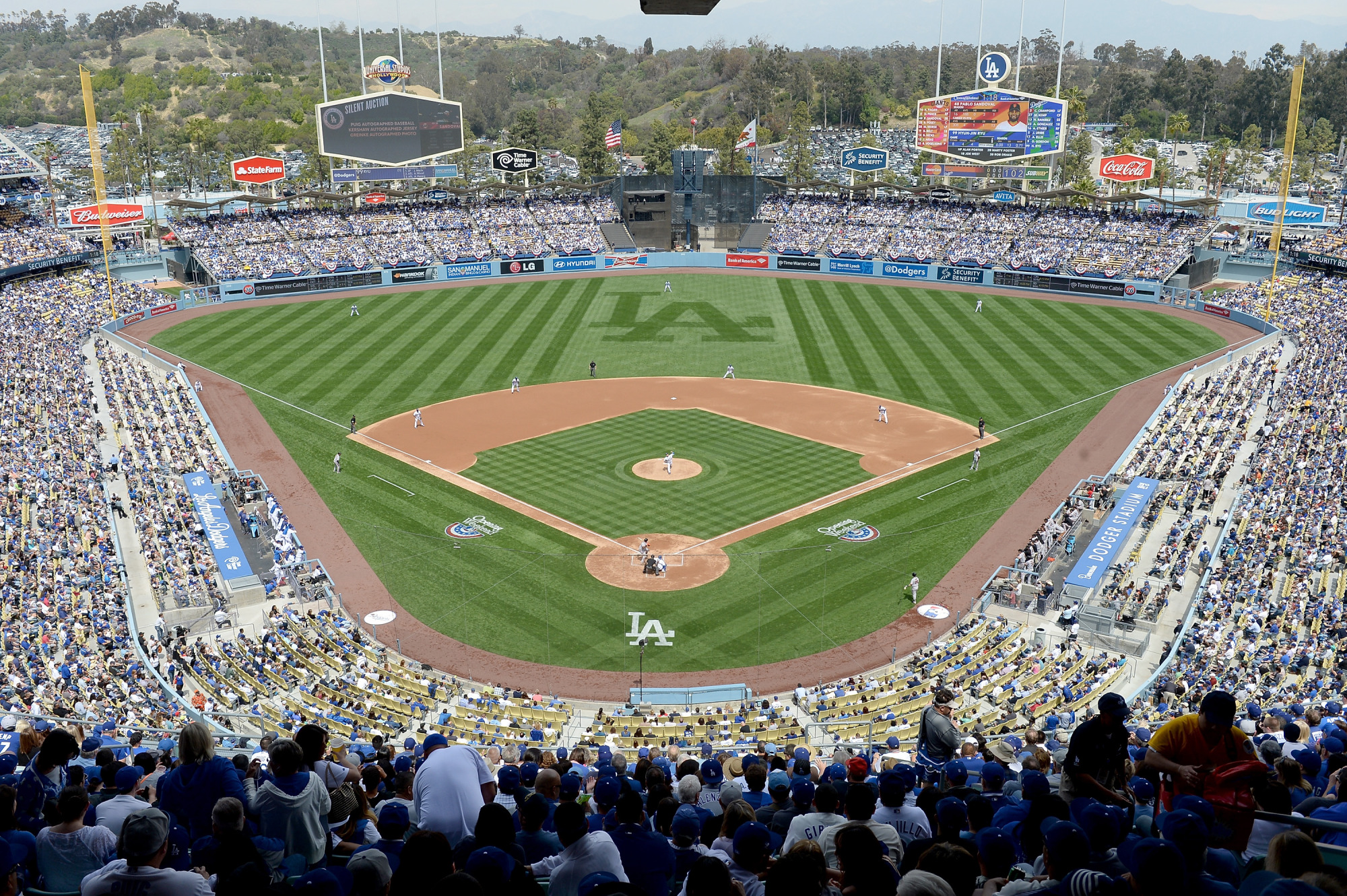
I chose a piece of architecture that causes a visceral response within me. And perhaps the thought is slightly biased because of my history with this piece of art but it causes deep feelings of beauty and adornment within me whenever I view even a picture of it or hear it's name. Dodger's Stadium. Even the nosebleeds are seats worth taking. Now I have a love for all baseball stadiums and fields as I see the diamond shape played out by the bases and the different patterns of diagonal, horizontal, and vertical lines that can be cut into the outfield and infield grass. The vertical lines of the the foul poles that as a kid you would look up at imagining yourself pulling a homer out of left field and just making it inside the pole because the anticipation gets to not only you but to everyone in attendance including the opponent as you watch and wait to see the signal from the umpire. The colors of the pale blue that line the field and the seats, which were originally much darker but overtime have faded as the sun wears them out. The use of the chairs causes a gritty texture to assemble and you can remember the feeling through your shirt on your back as you look at the stadium. You can feel the cold rusty arm rests on your bare arms on a cool fall night. To the untrained eye you see a lot of negative space, the field of grass without crop or building within it. But to a fan that grass is covered just enough by the three players in the outfield and the six in the infield. We see the bleachers as crowded space as they are filled with thousands of patrons but to those in attendance all you see is the negative space of the seats that aren't filled. You feel the ease of getting up to go to the bathroom and get a hot dog and can feel the used space over take you as you walk in through the tunnel that leads to your section of seating. Patriotism is contextually erected by the flags flown proudly in center field next to a California State flag and the lower flown Dodger flag. When I see Dodger Stadium I long to be there. I remember memories dating back to my first game when I was five, and I know that every time I enter the gates of Dodger stadium the feelings will always be the same as the first time I did so when I was five. The people may change but the smells, sights and game stay the same and for that my emotions are triggered in knowing that Dodger Stadium is an emotional staple for me.
http://www.dodgersbeat.com/wp-content/uploads/2015/01/DS.jpg
http://www.dodgersbeat.com/wp-content/uploads/2015/01/DS.jpg
Subscribe to:
Posts (Atom)